# Values & Units
most important units for styling
| Unit | Desription |
|---|---|
| rem | relative to font-size of root element |
| em | relative to font-size of parent element (2em = 2 times the size of current font) |
| % | relative to the parent element |
| vw | relative to 1% of width of viewport |
| vh | relative to 1% of height of viewport |
important notes: vw & vh depend on actual screen size, while % depands on parent element |
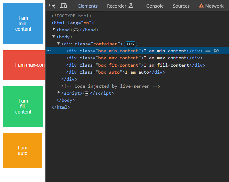
# Auto/Min/Max/Fit
width: auto; - takes the full width of container size
width: min-content; - takes the smallest container possible to fit all the content
width: max-content; - always stays at the same size (overflow is hidden there)
width: fit-content; - combination of them all
- is like
max-contentat full size &min-contentat minimal size - otherwise it fills the whole container
Example: